- Catalogs
- James Hardie - France
- The House: Designing the Home
The House: Designing the Home

The House: Designing the Home
When combining materials in home design, it is recommended to run materials horizontally to enhance structural logic. Vertical strips can make a house appear less structurally sound. The use of materials in horizontal bands can improve the perception of structural integrity.
- Stucco: A lime-based plaster traditionally used to cover masonry walls, suitable for arid and humid climates. Caution is advised when specifying stucco on wood frames due to potential leakage issues with artificial systems.
- Lap Siding: A non-structural exterior finish made of overlapping horizontal boards, historically wood, now often fiber-cement for durability and resistance to termites, rot, and fire.
- Shingles: Used for roofs and walls, historically cedar, now often fiber-cement for durability and ease of maintenance.
- Stone: A load-bearing material, traditionally used for entire buildings, now often for bases or highlights. Use consistently on all sides of a house.
- Brick: A man-made masonry material, traditionally load-bearing, now often used as veneer. Avoid partial brick veneers as they do not add value.
Design should prioritize simplicity and coherence over complexity. Avoid the default practice of adding unnecessary elements and mixing materials excessively. A well-designed building should be beautiful without relying on tricks. Focus on simple volumes and proportions to create aesthetically pleasing homes.
Consider the entire house, not just the front elevation. Side and rear elevations should be designed with windows for cross ventilation and natural light. A coherent composition elevates the house beyond a series of walls.
Using fewer design elements can save money, allowing for reinvestment in quality features like windows. Avoid spreading the budget thinly over many elements, which can lead to poor execution.
Traditional architecture is not a style but a method based on common sense and innovation. It evolves by combining the best of past and present practices. Good traditional architecture respects material limits and common sense.
Sarah Susanka's concept of "The Not So Big House" emphasizes building smaller, more livable homes that focus on quality over quantity. This approach advocates for designing spaces that are truly lived in, enhancing both comfort and sustainability.
Catalog excerpts
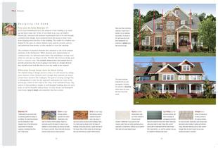
Take care when combining materials. A good rule of thumb is to run materials horizontally. The house to the right looks like it has been wallpapered; the materials in vertical strips, defy structural logic. This house illustrates materials that are used well together. Changing the materials in horizontal bands makes the house feel more structurally sound. Avoid Use 23 Stucco is a limebased plaster used as a finish material in arid and humid climates. Traditionally, it was used to cover masonry walls. Take care when specifying stucco, especially on wood frame. Artificial stucco systems often leak and create liability issues. Lap Siding is a nonstructural exterior wall finish consisting of overlapping horizontal boards to protect the house from water. Historically, siding was made of wood. Today, fiber-cement boards offer an alternative with the look of wood that is also termite-, rot- and fire-resistant, and can be installed to withstand high winds. Shingles are a series of small pieces of wood, cement or tile used as finishes for roofs and walls. Historically, many houses used decorative cedar shingles in gables and dormers. Today, alternative materials such as fiber-cement shingles offer the look of cedar, but are more durable and easier to maintain. D e s i g n i n g t h e H o m e Fi rst Learn the Rules: Mater ials 101 At the most fundamental level, the purpose of any building is to stand up and keep water out. Today, if you think it up, you can build it. Historically, structural and moisture requirements had to be met through common-sense design. Eaves projected from the house to keep water from dripping down the face of the building. The width of a window was limited by the span of a lintel. Shutters were used for security, privacy and protection from storms, so they needed to cover the opening. The evolution of practical elements into ornament is one of the primary problems of the McMansion. When elements defy material limits or common sense, we subconsciously know that something is wrong, even when we can’t put our finger on why. The first rule of house design goes back to common sense: For example, shutters don’t necessarily have to provide protection, but if you’re going to use them as a design element they should at least look like they’d cover the width of the window. Differentiate Through Design: Avoid the Default Setting The default setting of design practices today is to add interest by adding more elements. If the elements aren’t enough, then materials are mixed around these elements like wallpaper. The goal of creating a design that is distinguished is valid, but the approach undermines the value of the streetscape, which in turn reduces the value of the individual house. The answer to this problem is simple. A well-designed building does not need tricks. It will be beautiful without them. To truly elevate and distinguish your house, keep it simple and remember that less is more. 22 Materials 101 Traditionally, the structural limits of materials guided the design of a building. The industrial revolution and the availability of steel released many of the dimensional requirements of materials, resulting in buildings that often don’t make sense. Stone is a loadbearing material quarried from nature. Historically, it was used to construct entire buildings. Today it is commonly used for the base of a house or as a highlight in a brick building. Use stone on all sides of a house or not at all. Stone fronts defy structural common sense and are a false economy. Brick is a man-made, load-bearing masonry material of clay and sand. Like stone, it was once used to construct entire buildings. Today, it is mostly used as veneer and for the bases of buildings. Avoid using brick as a veneer over part of the house. Strips of brick veneer do not add value; they only show that you couldn’t afford all brick. T h e H o u s e
Open the catalog to page 1
building.” It looks fine on paper, but when the house gets built, we can see all the sides. To compound the problem, in many of these brick-front houses, windows are left off the side elevations or, if they are used, they are flush-mounted on the outside of the house without trim, making the wall look paper-thin. A house will look better and be more valuable if it lives well. Side windows create cross breezes and let more natural light into the house. When the sides are treated like part of the house, they elevate the house from a series of walls to a coherent composition. Design your side and...
Open the catalog to page 2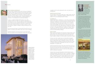
27 examples are the ones that understand the rules, even when they are breaking them. Regional Var iat ion and Style The case studies on the next few pages show a range of styles, sizes and regional variations, yet although the buildings are different, they are all unified by the same underlying principles of design. The McMansion Wikipedia aptly defines a McMansion as “a house that is both large like a mansion and as generic and culturally ubiquitous as McDonald’s fast food restaurants.” A McMansion is more for the sake of more. More gables, more materials, more bays, more square footage, etc....
Open the catalog to page 3All James Hardie - France catalogs and technical brochures
 Complete facade brochure
40 Pages


Archived catalogs
 HZ10™-HardiePanel pg. 99-105
7 Pages
 HZ10™-HardieShingle pg. 88-98
11 Pages
 HZ10™-HardiePlank pg. 77-87
11 Pages
 HZ10™-HardieSoffit pg. 65-76
12 Pages
 HZ10™-HardieTrim pg. 40-64
24 Pages
 HZ10™-HardieWrap pg. 27-39
13 Pages
 HZ5™-HardieShingle pg. 60-68
9 Pages
 HZ5™-HardiePlank pg. 49-59
11 Pages
 HZ5™-HardieSoffit pg. 39-48
10 Pages
 HZ5™-HardieTrim pg. 23-38
16 Pages
 power of design
2 Pages
 the value of design
3 Pages
 Hardie Warp
8 Pages
 Hardie® Reveal™ Panel
4 Pages
 HardiePlank - Dovercourt
2 Pages
 HardiePlank
2 Pages
 HardieBacker
2 Pages
 Hardie Pipe
41 Pages


- Rainscreen cladding
- Decorative paint
- Panel rainscreen cladding
- Outdoor paint
- Trim board
- Profile
- Smooth rainscreen cladding
- Decorative cassetta
- Industrial acrylic paint
- Gray cassetta
- Sustainable rainscreen cladding
- Metal profile
- Industrial wood paint
- Finish paint
- Vertical cladding
- Textured cladding
- Composite cladding
- Metal paint
- Aluminium edge trim
- Brown cassetta