- Catalogs
- DelightFULL
- Pantone Color Report for Fall Season


- Company
- Products
- Catalogs
- News & Trends
- Exhibitions
Pantone Color Report for Fall Season

Pantone Color Report for Fall Season
- Riverside (Pantone 14-4122): Cool, calming, and stable, with subtle vibrancy and sophistication.
- Airy Blue (Pantone 14-4122): Evokes lightness and freedom, pairs well with Lush Meadow, Taupe, or Dusty Cedar.
- Sharkskin (Pantone 17-3914): Neutral with an edge, versatile for pairing with any fall color.
- Aurora Red (Pantone 18-1550): Bold, warm, and dynamic, adds excitement and confidence.
- Warm Taupe (Pantone 16-1318): Suggests reassurance and stability, timeless and grounded.
- Dusty Cedar (Pantone 18-1630): A complex, warm pink shade, reminiscent of Rose Quartz.
- Lush Meadow (Pantone 18-5845): Rich, elegant, and vibrant, reminiscent of fresh botanicals.
- Spicy Mustard (Pantone 14-0952): Exotic and vibrant, adds unexpected vibrancy.
- Potter’s Clay (Pantone 18-1340): Sophisticated with russet undertones, a strong, earthy foundation.
- Bodacious (Pantone 17-3240): Versatile, vibrant purple with hints of pink, suitable for bold fashion statements.
Catalog excerpts
INTERIOR DESIGN & DECOR
Open the catalog to page 1
PANTONE’S COLOR REPORT FOR FALL 2016 INT E R IO R D E S IG N & D E CO R The idea behind this ebook is to inspire you regarding the color options that will be trending this Fall. We created 10 mood boards featuring interior design items to each one of the colors that are part of Pantone’s report This is a rich color palette, composed by 10 different hues - however, all these colors complete each other. As Leatrice Eiseman said in the official publication that introduces this color palette to the world, “Blue skies represent constancy as they are always above us. Grays give a feeling of stability,...
Open the catalog to page 3
WE ARE READY TO SHIP FINISH YOUR PROJECT NOW >
Open the catalog to page 4
PANTONE 14-4122 RIVERSIDE Particularities: - Takes precedence in the fall collections - Cool and calming, strong and stable - Displays a subtle vibrancy and sophistication - Borders on exciting yet maintains a sense of constancy ESSENTIAL HOME - DEAN ARMCHAIR | BRABBU - KASAI RUG | DELIGHTFULL - ETTA ROUND ESSENTIAL HOME- JACOBSEN SIDE TABLE | BOCA DO LOBO - OPORTO CABINETS
Open the catalog to page 5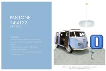
PANTONE 14-4122 AIRY BLUE Particularities: - Designers seeking weightlessness in a world heavy with conflict - the color evokes feelings of lightness and freedom - Blue tones appear in nearly half of the designs - Airy Blue nods to Serenity - Pair Airy Blue with Lush Meadow, Taupe or Dusty Cedar for fresh approach CIRCU - BUN VAN BED | DELIGHTFULL - 0 GRAPHIC LAMP | DELIGHTFULL - DIANA TABLE LAMP CIRCU - CLOUD LAMP | ESSENTIAL HOME - KUBRICK RUG
Open the catalog to page 7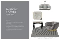
Particularities: - There’s an edge to Sharkskin, and yet it manages to remain neutral - Pair-able with almost any fall color, bright or muted - A color that the rest of the palette can literally and theoretically rest on - Showcases practicality through a dependable but contemporary lens DELIGHTFULL - GALLIANO SUSPENSION LAMP | KOKET - TAMARA MIRROR | ESSENTIAL HOME - BURTON RUG DELIGHTFULL - DIANA TABLE | BOCA DO LOBO - TRINITY NIGHTSTAND
Open the catalog to page 8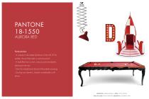
Particularities: - In contrast to the stable backbone of the Fall 2016 palette, Aurora Red adds a welcome punch - A bold Red that is warm, sensual and immediately pleasing to the eye - Gets the metaphorical blood of the palette pumping - Exciting and dynamic, breeds unmistakable confidence DELIGHTFULL - DIANA PENDANT | CIRCU - ROCKY ROCKET BOCA DO LOBO - ROYAL SNOOKER | DELIGHTFULL - D GRAPHIC LAMP
Open the catalog to page 9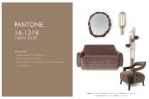
PANTONE 16-1318 WARM TAUPE Particularities: - Suggests reassurance and stability - Trusted, organic and grounded - Departs slightly from the foundations of the Fall 2016 palette - It is a timeless hue BRABBU - HAIKU MIRROR | DELIGHTFULL - TURNER WALL LAMP | DELIGHTFULL - NEIL FLOOR LAMP ESSENTIAL HOME - DORIS SOFA | BRABBU - OKA ARMCHAIR
Open the catalog to page 10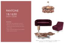
PANTONE 18-1630 DUSTY CEDAR Particularities: - Like Airy Blue, Dusty Cedar gives a nod to the PANTONE Color of the Year 2016, Rose Quartz - A fall and winter version of the Pinks we’re used to seeing in spring - Dustier rose-toned Pink shade with some complexity - Exudes warmth and welcome DELIGHTFULL - ETTA ROUND CHANDELIER | ESSENTIAL HOME - ROMERO ARMCHAIR| BRABBU - WALES SOFA BOCA DO LOBO - MONET CENTER TABLE | DELIGHTFULL - DONNA TABLE LAMP
Open the catalog to page 11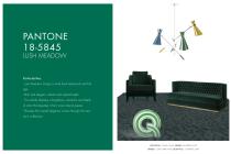
PANTONE 18-5845 LUSH MEADOW Particularities: - Lush Meadow brings to mind fresh botanicals and foliage - Rich and elegant, vibrant and sophisticated - This shade displays a brightness, panache and depth of color that elevates it from more natural greens - Elevates the overall elegance woven through this season’s collections DELIGHTFULL - STANLEY LAMP | BRABBU - BOURBON SOFA BRABBU - COMO ARMCHAIR | DELIGHTFULL - Q GRAPHIC LAMP
Open the catalog to page 12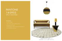
PANTONE 14-0952 SPICY MUSTARD Particularities: - An exotic addition - Adds another splash of uplifting vibrancy - Unexpected and unusual - Comes through in both the abstract and geometric accents that designers employed DELIGHTFULL - KRAVITZ PENDANT | BRABBU - SEAT SOFA BOCA DO LOBO - ALLEY TABLE LAMP | KOKET - YASMINE SIDE TABLE
Open the catalog to page 13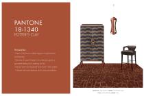
PANTONE 18-1340 POTTER’S CLAY Particularities: - Potter’s Clay has an added degree of sophistication and layering - Elements of russet Orange in its undertones gives a grounded feeling that’s anything but flat - Neutral earth tone expected for fall and winter palette - A shade with real substance and a strong foundation DELIGHTFULL - ETTA PENDANT | BRABBU - KANSAS BAR CHAIR KOKET - DIVINE ARMOIRE | BRABBY -
Open the catalog to page 14
Particularities: - Lends itself to vibrant color combinations - Versatile; can be used with Pinks and Reds Bright, rich Purple, with hints of a more sophisticated Pink - Turns fashion accents into fashion statements BOCA DO LOBO - MAJESTIC | KOKET - CHIGNON CHAIR BOCA DO LOBO - ZARAGOÇA SIDE TABLE | KOKET - CHANDELIER
Open the catalog to page 15
ROOM BY ROOM MORE THAN 450 PAGES, MORE THAN 1000 PRODUCTS AND 1250 INSPIRATIONS WWW.COVETHOUSE.EU | [email protected]
Open the catalog to page 16
ITEMS TO YOUR LIVING ROOM DESIGN SPONSORED BY oelightFuii ^ Unique Lamps
Open the catalog to page 18All DelightFULL catalogs and technical brochures
 PRESS KIT 2021 | DelightFULL
30 Pages
 Covet Awards 2021
7 Pages
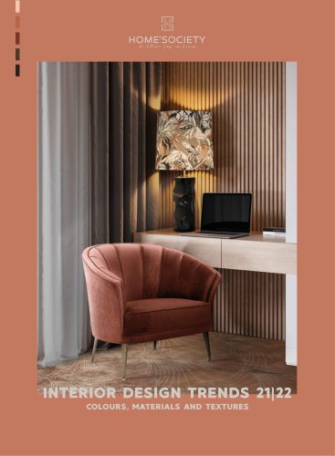 Interior Design Trends 21|22
138 Pages
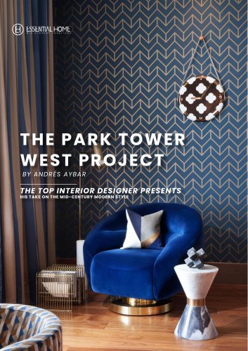 The Park Tower West Project
9 Pages
 COLTRANE FAMILY DESIGN
8 Pages
 BRUBECK FAMILY LIGHTING
10 Pages
 TURNER FAMILY LIGHTING
7 Pages
 SCOFIELD SUSPENSION
4 Pages
 ATOMIC FAMILY LIGHTING
8 Pages
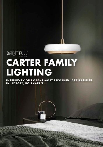 CARTER FAMILY LIGHTING
8 Pages
 DELIGHTFULL PROJECT
7 Pages
 NEW COVET NYC BY RDD
14 Pages
 Winter Color Trends
10 Pages
 Outdoor Trends 2020
14 Pages
 Press Release Pantones
11 Pages
 Gallery Garage Exhibition
12 Pages
 COVETED EDITION TRENDS 2020
134 Pages
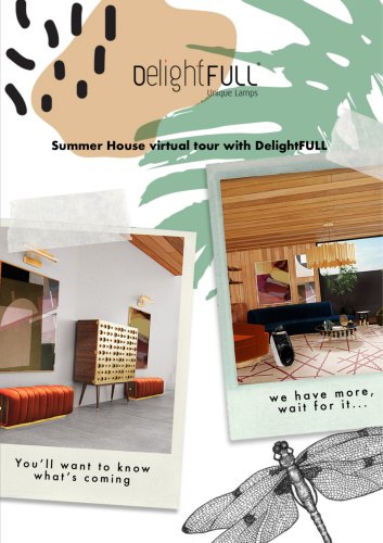 Summer House by DelightFULL
5 Pages
 PREVIEW SUMMER TRENDS
6 Pages
 DelightFULL Catalogue 2020
119 Pages
 New Pieces Of The Decade!
22 Pages
 Table Lamps
34 Pages


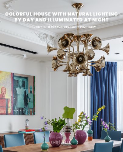











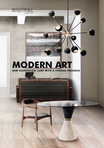







Archived catalogs
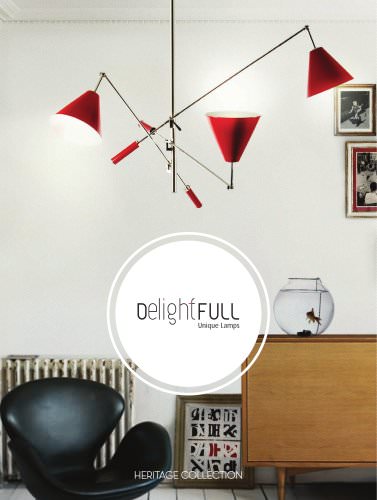 Delightfull - Do You know Heritage?
134 Pages
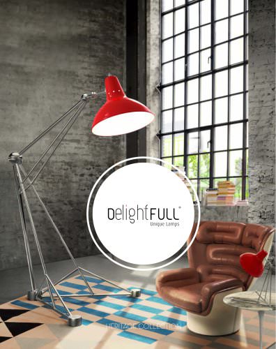 delightfull_catalogue
186 Pages
 100 Contemporary Floor Lamps
112 Pages
 BILLY TABLE
1 Page
 Mid-Century Modern Wall Lamps
50 Pages
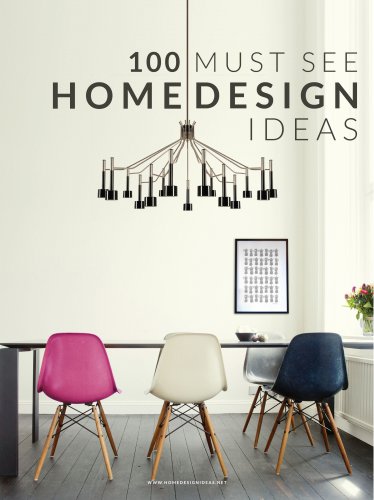 100 Must See Home Design Ideas
114 Pages
 100 Black & White Floor Lamps
110 Pages
 Rose Quartz & Serenity Blue
27 Pages
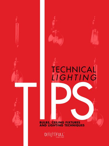 Technical Lighting Tips
22 Pages
 BRUBECK
1 Page
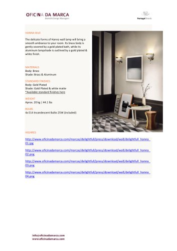 HANNA
HANNA1 Page
 CHARLES | SUSPENSION
5 Pages
 BRUBECK | SUSPENSION
7 Pages
 MONOCLES SIDEBOARD
5 Pages
 ATOMIC | SUSPENSION
6 Pages
 COLTRANE | SUSPENSION
6 Pages
 BOTTI | SUSPENSION
7 Pages
 DUKE | SUSPENSION
7 Pages
 DIANA | SUSPENSION
5 Pages
 ELLA | SUSPENSION
5 Pages
 ETTA
ETTA5 Pages
 GALLIANO | SUSPENSION
6 Pages
 IKE | SUSPENSION
6 Pages
 COSMO | SUSPENSION
5 Pages
 MADELEINE | SUSPENSION
5 Pages
 MATHENY
7 Pages
 TURNER FLOOR
5 Pages
 NEIL | SUSPENSION
5 Pages
 NORAH | SUSPENSION
5 Pages
 SIMONE | SUSPENSION
5 Pages
 STANLEY
5 Pages
 SINATRA | SUSPENSION
5 Pages
 KRAVITZ Pendant Light
5 Pages
 Ike Center Table
5 Pages
 Ike Side Table
5 Pages
 Monocles Cabinet
5 Pages
 Revolver Dining Table
5 Pages
 Botti Side Table
5 Pages
 Revolver Side Table
5 Pages